The quest for the perfect paint color can often feel like an epic journey. Among the countless shades available, some hues simply transcend expectations, transforming living spaces into havens of serenity and style. Today, we’re diving deep into one such exceptional color that has captivated homeowners and designers alike: Sherwin-Williams Rainwashed. This particular shade has adorned our kitchen, dining, and living rooms since our extensive home remodel, and after nearly two years of daily enjoyment, I can unequivocally declare it the most beautiful blue-gray-green color imaginable.
Our home’s open-concept layout demanded a color that could flow seamlessly from one area to another while maintaining a distinct personality. Sherwin-Williams Rainwashed proved to be precisely that. It’s a sophisticated blend that manages to be both profoundly soothing and vibrantly characterful, adding a refreshing pop of color without overwhelming the senses. Its unique composition makes it incredibly versatile, acting as a true chameleon depending on the light and surrounding decor.
The Enchanting Nuance of Sherwin-Williams Rainwashed: A Chameleon of Color
What truly sets Sherwin-Williams Rainwashed apart is its remarkable ability to shift its identity. It’s not simply blue, gray, or green; it’s a harmonious symphony of all three. In some lights, particularly those with a cooler cast or in north-facing rooms, the blue undertones become more prominent, creating an airy and expansive feel. In contrast, under warmer illumination or in sun-drenched spaces, the green notes emerge, infusing the room with a sense of natural tranquility and inviting the outdoors in. The subtle gray undertone acts as a grounding force, ensuring the color never feels too saccharine or bold, providing a sophisticated neutrality that appeals to a wide range of tastes.
This chameleon-like quality means that Rainwashed offers a dynamic visual experience throughout the day. What might appear as a soft, muted blue in the morning light can transform into a gentle sage green by afternoon and a sophisticated gray-green in the evening, bathed in ambient lighting. This constant subtle evolution keeps the walls interesting and prevents the color from ever feeling monotonous. It’s a testament to the masterful blending of pigments that Sherwin-Williams consistently delivers, creating shades that truly live and breathe within a space.
Finding the Perfect Balance: Neutrality Meets Personality
One of the greatest challenges in interior design is striking a balance between creating a neutral backdrop that allows decor to shine and injecting enough personality to make a space feel unique and inviting. Rainwashed excels in this delicate dance. It’s undeniably neutral, providing a calm and collected foundation that pairs beautifully with almost any style, from minimalist modern to rustic farmhouse. Yet, it’s far from boring. The inherent color—that elusive blend of blue, gray, and green—lends a quiet confidence to the walls, preventing them from fading into the background. It adds an understated elegance and a breath of fresh air that purely neutral colors often lack.
This versatility makes it an ideal choice for open-concept homes where continuity is key. Instead of needing different colors to define areas, Rainwashed allows each space to retain its distinct character through furniture and decor while maintaining a cohesive flow throughout the entire living area. It fosters an environment that feels both sophisticated and utterly comfortable, embodying a sense of effortless style that many aspire to achieve.
Pairing Sherwin-Williams Rainwashed: A Decorator’s Dream Come True
A truly great paint color enhances the elements around it, and Rainwashed does this effortlessly. Its nuanced hue serves as a superb foundation, making it incredibly easy to coordinate with a variety of materials, textures, and accent colors. We’ve had the pleasure of observing how this remarkable shade interacts with various design elements in our home, always yielding stunning results.
Harmonizing with Flooring and Furniture
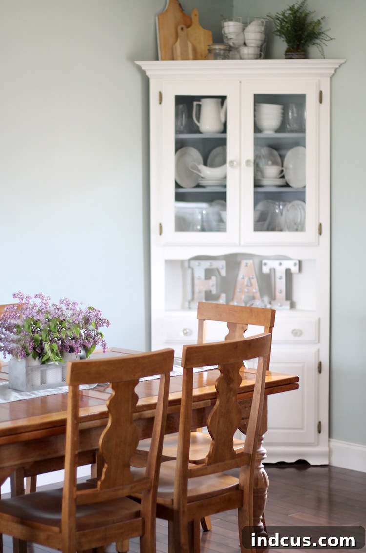
One of the most striking combinations in our home is how Rainwashed contrasts beautifully with our dark brown wood floors. The depth and richness of the dark wood ground the airy lightness of the walls, creating a sophisticated and balanced aesthetic. This pairing accentuates the warmth of the wood while allowing the wall color to truly pop, making the entire space feel both cozy and expansive.
Similarly, the crispness of our white couch and pristine white trim work is dramatically highlighted against the Rainwashed walls. White elements, whether furniture, baseboards, or crown molding, appear even brighter and more defined, creating a clean, fresh, and modern look. This contrast adds definition and a touch of classic elegance, proving that simple pairings can often yield the most impactful results.
Accent Colors and Decor Styles
Over the past two years, we’ve experimented with numerous color combinations for accents, and Rainwashed has proven to be incredibly forgiving and versatile. It looks fabulous with:
- Warm Metals: Golds, brass, and copper accents add a touch of luxury and warmth, creating a sophisticated contrast with the cool undertones of Rainwashed.
- Natural Woods: Beyond dark floors, lighter wood furniture and decor pieces (like wicker or bamboo) enhance its earthy green notes, reinforcing that coveted spa-like feel.
- Soft Pinks and Corals: For a more playful and inviting look, muted pinks, soft corals, or even a touch of peach can introduce warmth and vibrancy without clashing.
- Deep Navy and Teal: To create a sense of depth and coastal elegance, darker blues and teals can be introduced through textiles, artwork, or decorative objects.
- Cream and Ivory: These softer whites offer a gentler contrast than stark white, creating a more cohesive and understated palette.
This adaptability makes decorating and redecorating an absolute joy. Whether we’re transitioning between seasons or simply refreshing our decor, Rainwashed consistently provides the perfect canvas.
Transforming Every Room: The Spa-Like Serenity of Rainwashed
The gentle, calming presence of Sherwin-Williams Rainwashed extends its appeal far beyond just living areas. It truly has a spa-like feel, making it an ideal candidate for various rooms where tranquility and rejuvenation are paramount.
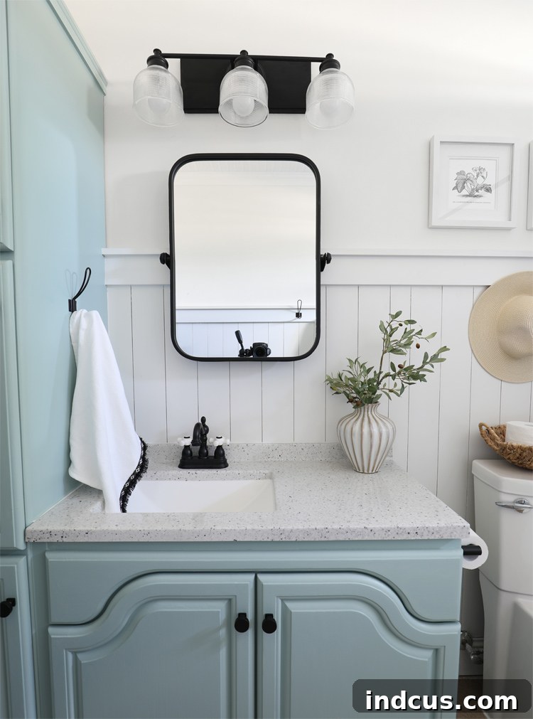
- Bathrooms: Imagine stepping into a bathroom painted with Rainwashed – the ultimate sanctuary. Its refreshing green and blue notes evoke a sense of clean calm, turning a functional space into a personal retreat. Paired with white porcelain, chrome fixtures, and natural wood accents, it creates a pristine and invigorating environment.
- Master Bedrooms: For a space dedicated to rest and relaxation, Rainwashed is an inspired choice. Its soothing qualities promote peace and serenity, making it easier to unwind after a long day. It’s elegant without being overtly feminine or masculine, offering a universally appealing backdrop for bedding and furniture.
- Home Offices: In a world of increasing remote work, creating an inspiring yet calm home office is crucial. Rainwashed can foster a focused and stress-free environment, its gentle color providing a welcome respite from digital screens.
- Nurseries: For a baby’s room, this soft, serene shade offers a gentle and comforting atmosphere, perfect for nurturing new life. It’s a timeless alternative to traditional pastel blues or greens, offering sophistication that will grow with the child.
We are particularly excited to see how it transforms our kitchen once that phase of our remodel is complete. I have a strong feeling that its soft hue will absolutely sing next to crisp white cabinets and will beautifully complement stainless steel appliances, creating a clean, modern, and incredibly inviting culinary space. The anticipation of this next transformation only reinforces our love for this extraordinary paint color.
Choosing Your Perfect Paint Color: Tips for Success with Rainwashed and Beyond
While Sherwin-Williams Rainwashed might sound like a dream, choosing any paint color requires careful consideration. Here are a few tips to ensure you find your perfect shade:
- Sample Extensively: Never skip this step! Paint large swatches (at least 2’x2′) directly on your walls or on large foam boards you can move around. Observe them at different times of the day.
- Observe Lighting Conditions: Natural light (north, south, east, west-facing rooms), artificial light (warm vs. cool bulbs), and even the color of your landscaping outside your windows will dramatically affect how a color appears.
- Consider Undertones: Every color has an undertone. Rainwashed is a fantastic example of a balanced blue-gray-green, but understanding the dominant undertones in other colors (e.g., a gray with a purple undertone) will help you avoid clashes.
- Look at Adjacent Colors: How will your chosen color interact with the paint in adjoining rooms, or with your flooring and fixed elements like countertops? Ensure a harmonious flow.
- Trust Your Gut: While expert advice is helpful, ultimately, you are the one who will live with the color every day. Choose a shade that genuinely makes you feel happy and comfortable in your home.
My Two-Year Journey with Rainwashed: Continued Delight
Living with Sherwin-Williams Rainwashed for almost two years has been a continuous delight. It has gracefully endured seasonal decor changes, daily life, and the evolving tastes of our family, consistently delivering beauty and tranquility. It’s a testament to a truly well-formulated paint color that it continues to elicit compliments and admiration from everyone who visits our home.
It’s more than just paint on a wall; it’s an atmosphere, a feeling of calm and sophistication that permeates our primary living spaces. We couldn’t be happier with our choice, and it continues to inspire us in future renovation plans. We hope this deep dive into Sherwin-Williams Rainwashed has provided valuable insight and inspiration for your next home project.
What do you think of this captivating color? Would Sherwin-Williams Rainwashed be a color you’d choose for your own home? Share your thoughts below!