Transforming Your Home’s First Impression: A Dramatic Entryway Makeover with Bold Navy Blue Paint
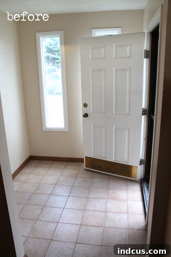
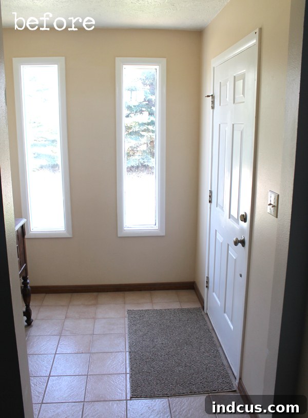
Every home tells a story, and the entryway is often the opening chapter. For me, one of the most cherished features of our home is its dedicated entryway. It’s more than just a pass-through; it’s a welcoming “public” space, a spot where conversations naturally unfold as guests arrive and depart. There’s a distinct charm in having a defined area to greet visitors, gather coats, and set the tone for the rest of our home’s personality. However, despite its inherent potential and the natural light it receives, this crucial space had, until recently, remained remarkably bland and understated.
It was a stark canvas, lacking the warmth, character, and deliberate design that I envisioned for the gateway to our sanctuary. As the very first impression our home makes, I knew it deserved an update that reflected our style and created an inviting atmosphere. While we harbored grand, long-term plans for intricate woodworking features – a design dream that remains on our renovation wish list – the reality of recent projects had set in. Fresh off the intensive craft room overhaul, our DIY reserves were running on fumes. Implementing complex carpentry was simply not feasible in the immediate future.
BEHR® sponsored this blog post. The opinions and text are all mine.
From Grand Visions to Paint Perfection: Embracing a Practical Makeover
It was clear: a quick, impactful, and budget-friendly solution was needed to bridge the gap between our ambitious future plans and the current, uninspired reality. And what better hero for such a task than paint? The transformative power of a fresh coat of paint is truly remarkable, capable of dramatically altering a space’s mood and aesthetic without the significant time, cost, or expertise required for structural changes. It offered the perfect remedy for our renovation fatigue, promising immediate gratification and a renewed sense of purpose for the entryway.
Beyond the color change, I also decided to address a smaller, yet significant detail: the baseboards. We’ve been progressively updating the baseboards throughout the house to a more modern, consistent style, and extending this effort into the entryway seemed like a logical and cohesive step. This dual approach – a bold new wall color combined with updated trim – would create a polished and intentional look, making the entryway feel less like an afterthought and more like a thoughtfully designed part of our home.
The Bold Choice: Why Navy Blue and Premium Paint Matter
Given the entryway’s compact size and its generous intake of natural light, I felt empowered to make a bold design statement. This combination of size and light meant that a dark color wouldn’t necessarily shrink the space, but rather imbue it with a sense of depth and sophistication. My vision quickly solidified: a deep, dramatic navy blue. This particular shade evokes a feeling of timeless elegance and warmth, a perfect counterbalance to the bright, open spaces typically found in a home. It was a choice that felt both daring and classic, promising to elevate the entire feel of our home’s entrance.
However, opting for such a dark and prominent color came with its own set of considerations, not least of which was the fear of commitment and potential regrets. A rich navy blue, especially in an area exposed to direct sunlight, demands a high-quality paint. Fading would be an unacceptable outcome, compromising the very impact I sought to achieve. Moreover, the inherent intensity of a dark hue meant that inconsistencies in coverage or a poor finish would be glaringly obvious. To ensure the success and longevity of this daring transformation, investing in premium interior paint was non-negotiable. I needed a product known for its durability, vibrant pigment retention, and superior coverage.
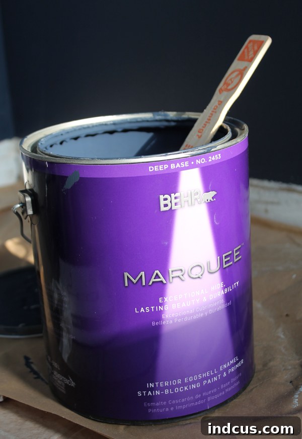
My journey led me to Home Depot, where I confidently selected a gallon of Behr’s top-tier interior paint: MARQUEE. BEHR MARQUEE paint is renowned for its advanced formula, which boasts a guaranteed one-coat coverage feature – a godsend for any DIY painter – provided you choose one of their pre-selected colors. While their color palette is extensive and impressive, I had a very specific shade in mind. Instead of selecting a Behr color, I opted for their expert color-matching service, requesting them to replicate the exquisite Benjamin Moore Hale Navy. This particular navy has garnered immense popularity among interior designers and creative communities online for its perfect balance of warmth and depth, avoiding any hint of being too vibrant or too muted. It was a “sure thing” in the world of dark blues, and I trusted the collective wisdom that it would steer me in the right direction, calming my initial apprehension about going so dark.
Mastering the Art of Painting: Essential Prep and Application Tips
Before dipping the first brush, I performed a critical, yet often overlooked, ritual: I thoroughly read the back of the paint can. This isn’t just a suggestion; it’s an imperative step for any successful painting project. The manufacturer’s instructions provide invaluable information specific to that product – recommended drying times between coats, ideal application techniques (brush, roller, spray), optimal temperature ranges, and any special preparation requirements. Seriously, take the time to read it! It’s a treasure trove of expert advice that can save you countless headaches and ensure a professional finish.
With the theoretical knowledge absorbed, it was time for the practical, yet equally crucial, preparation steps. First, the walls needed a meticulous cleaning. Accumulated dust, grime, and any lingering marks can compromise paint adhesion and finish, so a thorough wipe-down with a damp rag was essential. Next, I tackled the imperfections left by previous occupants – unsightly nail holes and minor dings. These were filled with spackling compound, allowed to dry completely, and then lightly sanded to achieve a smooth, flush surface. To ensure a seamless blend, especially over the patched areas, I applied a light coat of spray texture, carefully matching the existing wall texture. This step is vital for avoiding noticeable smooth patches on an otherwise textured wall. A crucial lesson I’ve learned the hard way is the absolute necessity of priming over these patched areas. Skipping primer on repairs invariably leads to an uneven sheen, where the repaired spots absorb paint differently, creating unsightly dull or overly shiny patches that mar the final appearance. A dedicated primer layer guarantees a uniform surface for the topcoat.
Finally, to achieve crisp, clean lines and protect adjacent surfaces, I meticulously taped off the ceiling line and lay down protective paper on the floor. This comprehensive prep work, while seemingly tedious, is the backbone of a high-quality paint job. It ensures that the paint adheres properly, the finish is smooth and consistent, and the surrounding areas remain pristine. Once all the preparation was complete, it was time to “go to town” with the paint!
I began the first coat late one evening, around 10:00 PM. While my enthusiasm was high, painting in the semi-dark, under artificial light, proved to be less than ideal. Upon waking the next morning, the tell-tale signs of a rushed, poorly lit application were evident: a few missed spots, particularly in corners and along edges. However, despite this late-night misjudgment, the Behr MARQUEE paint still demonstrated impressive coverage. A quick second coat during daylight hours easily remedied the missed spots, ensuring a rich, even, and flawless finish. Even with my small error, the overall coverage was pretty darn good, solidifying my trust in the quality of the paint.
The Dramatic Reveal: Witnessing the Power of Paint
Are you ready to witness the complete transformation? The anticipation was palpable as the final coat dried, and stepping back to admire the finished entryway was nothing short of exhilarating.
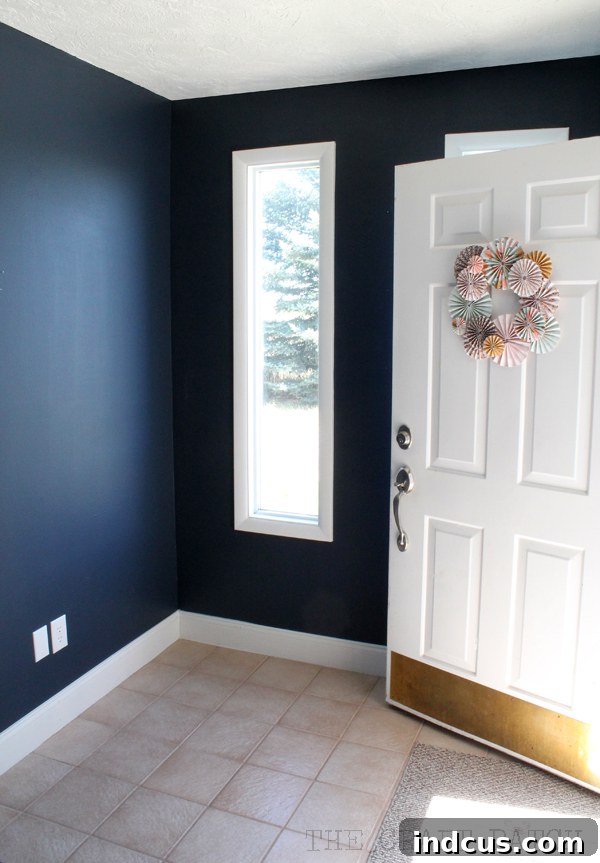
It’s a truly monumental change, that much is certain. The entryway, once an unassuming pass-through, now commands attention with its infusion of drama, undeniable sophistication, and striking contrast. The deep navy blue of Benjamin Moore Hale Navy has completely redefined the space, making it feel intentional, inviting, and deeply luxurious. I absolutely love the profound character it brings!
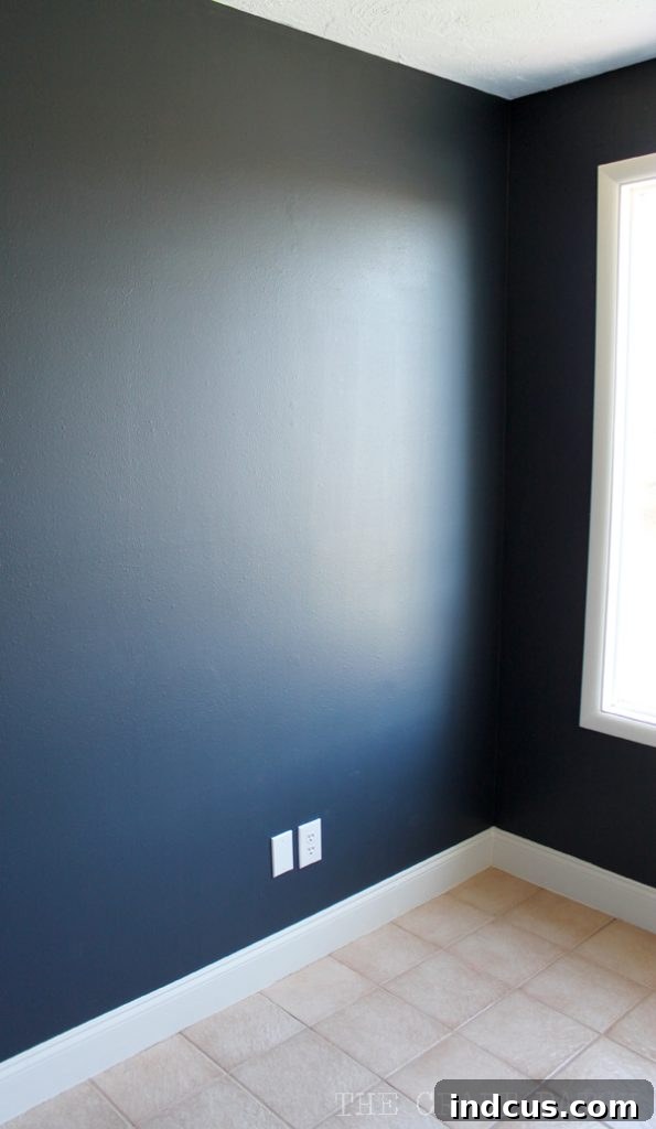
The transformation is truly remarkable in how it interacts with the existing elements. Doesn’t it make the crisp white door and the freshly installed white trim absolutely pop? The contrast is simply stunning, creating clean lines and a modern aesthetic that feels incredibly fresh. This rich backdrop makes every architectural detail stand out with renewed clarity. What’s more, I even find myself appreciating the existing tile flooring in a new light. The deep blue walls somehow enhance its subtle patterns and tones, making it appear more refined and cohesive with the overall design. The sheer power of paint to revitalize, redefine, and elevate a space never ceases to amaze me. It’s an incredible testament to how a single change, thoughtfully executed, can ripple through an entire room, enhancing every feature within it.
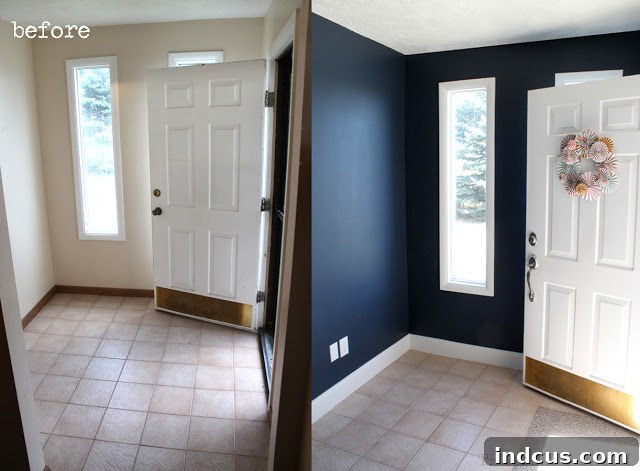
Our once bland entryway is now a vibrant, welcoming space that sets a sophisticated tone for the rest of our home. It’s a testament to the fact that even without embarking on extensive structural renovations, a well-chosen paint color and meticulous application can yield truly transformative results. This project reinforced my belief in the accessibility and impact of DIY home improvements. The entryway now feels like a warm embrace, inviting guests in with its refined elegance and reflecting the care we put into our home. It perfectly fulfills its role as the first, powerful impression.
Be sure to check out Part 2 of this post to see the entryway all decorated, bringing this stunning new backdrop to life with carefully curated decor!